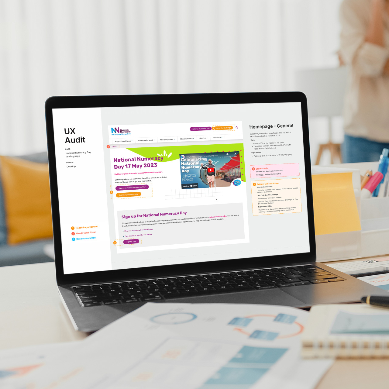
User interface design for the redevelopment of The RSA website
SUMMARY
As a contractor with Brighton-based digital agency, MBA, I was hired as the UI designer, responsible for implementing the new look & feel across all sections of the site as it was being developed. The project followed a sprint-based, Agile methodology, with daily cross-disciplinary team meetings and regular client involvement.
CLIENT
The RSA
MY ROLE
UI Design
Style Guide
TOOLS
Sketch
Illustrator
Photoshop
Project brief
BACKGROUND
The Royal Society for the encouragement of Arts, Manufactures and Commerce (RSA) was founded in 1754 to promote arts, manufacturing, and commerce for the public good. It is a multidisciplinary institution with a mission to "enrich society through ideas and action."
The organisation aims to create a platform for innovative thinking and practical solutions to some of the world's most pressing social, economic, and environmental challenges.
OBJECTIVE
The RSA has a wide range of activities and initiatives, including research projects, educational programs, public events, and a network of fellows and members. The redevelopment of the entire website was a vast project spanning several months and involved a cross-disciplinary team of UX researchers, writers, designers and developers.
Approach
AGILE METHODOLOGY
Agile web development is an iterative and flexible approach to building web applications that emphasises rapid prototyping, continuous improvement, and collaboration. It involves breaking down the development process into sprints, typically lasting one to four weeks, with a focus on frequent communication and adapting to feedback from stakeholders. The approach allows teams to quickly respond to changing requirements and deliver high-quality products that meet customer needs.
ROLE
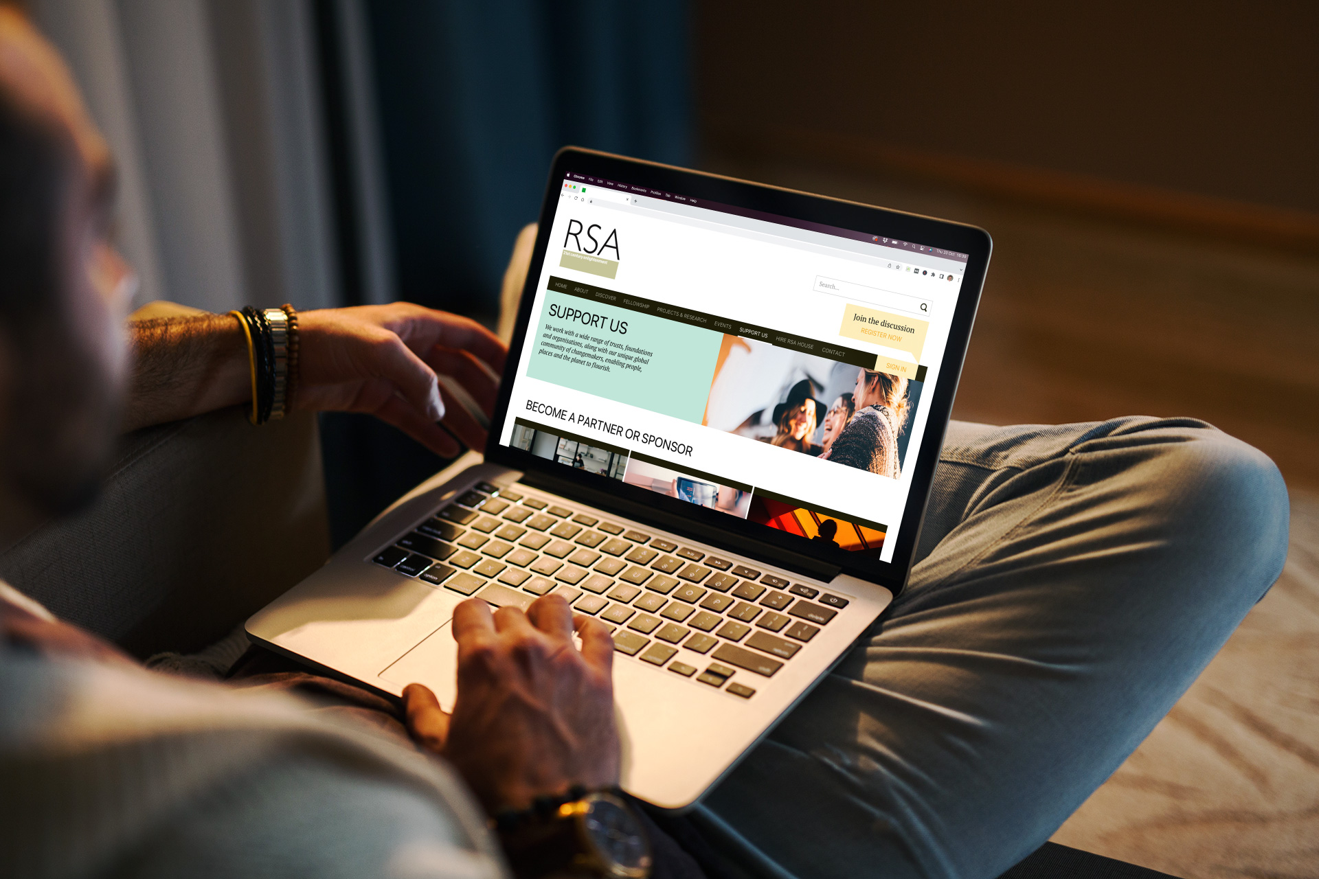
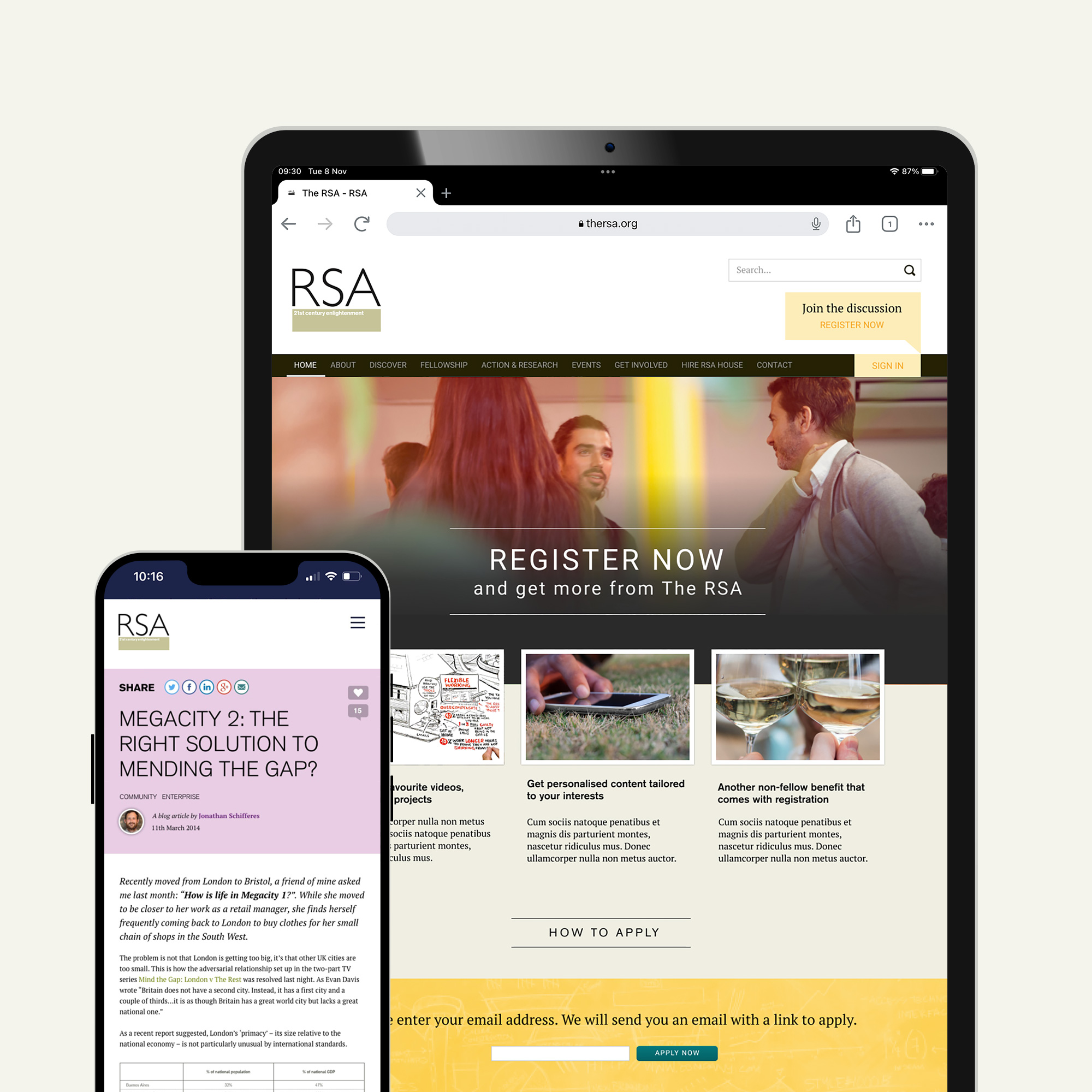
I was employed as the UI designer, responsible for designing the visual elements of The RSA website. Top-leveI art direction had been signed off by the client prior to my engagement and I was responsible for implementing this design style throughout.
I was based on-site for the majority of the project, working closely with other members of the design team, including the creative director, information architecture (IA), developers, and project manager. We met each morning for 'scrums' and client feedback was sought at regular intervals. Feedback from user research and usability testing was bulit in to refine the designs.
UI Design
I was the sole UI designer on the project responsible for creating hi-fidelity design mockups for the entire site. I worked closely with the IA team and creative director. Sketch was MBA's preferred graphics software which I quickly adopted and became proficient over the course of the project.
Design System
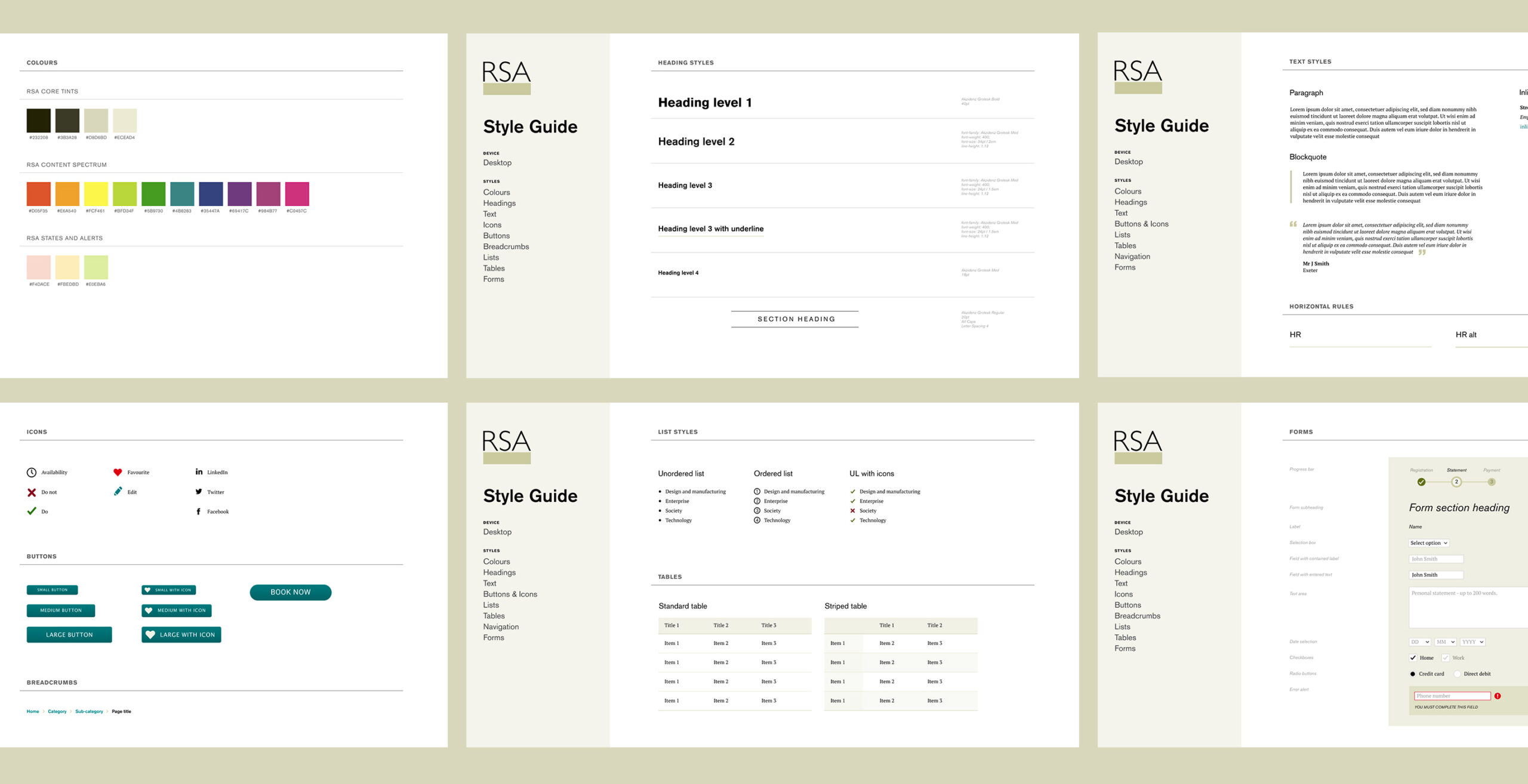
Throughout the project I maintained a style guide document which defined the formatting and style rules for repeating elements on the website such as heading styles, forms and icons.
Design Platforms
Page layouts and visual elements were laid out in Sketch with Adobe Illustrator and Photoshop used to design elements such as image manipulation and icons.
Selected Work
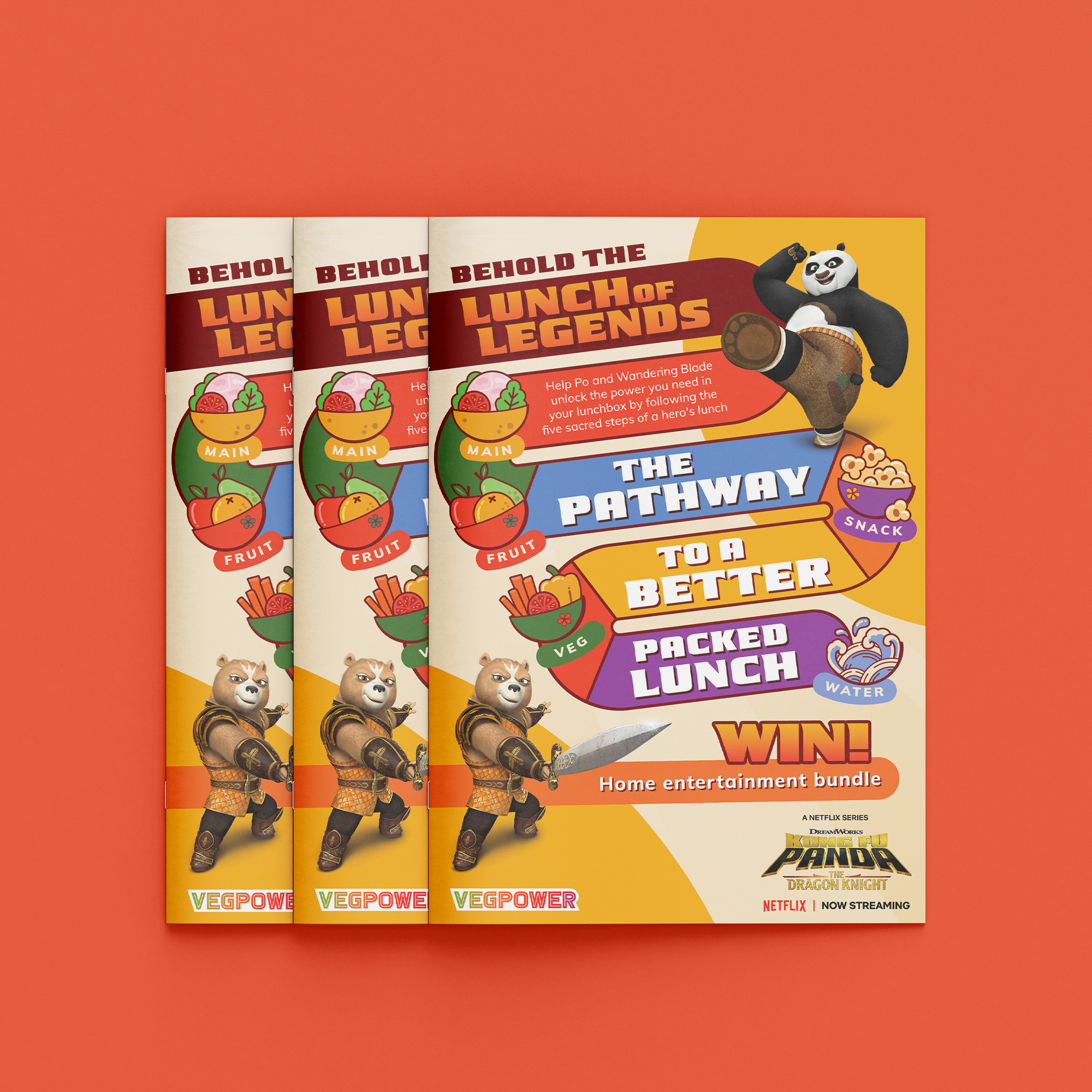
Veg Power x Kung Fu PandaPrint Design
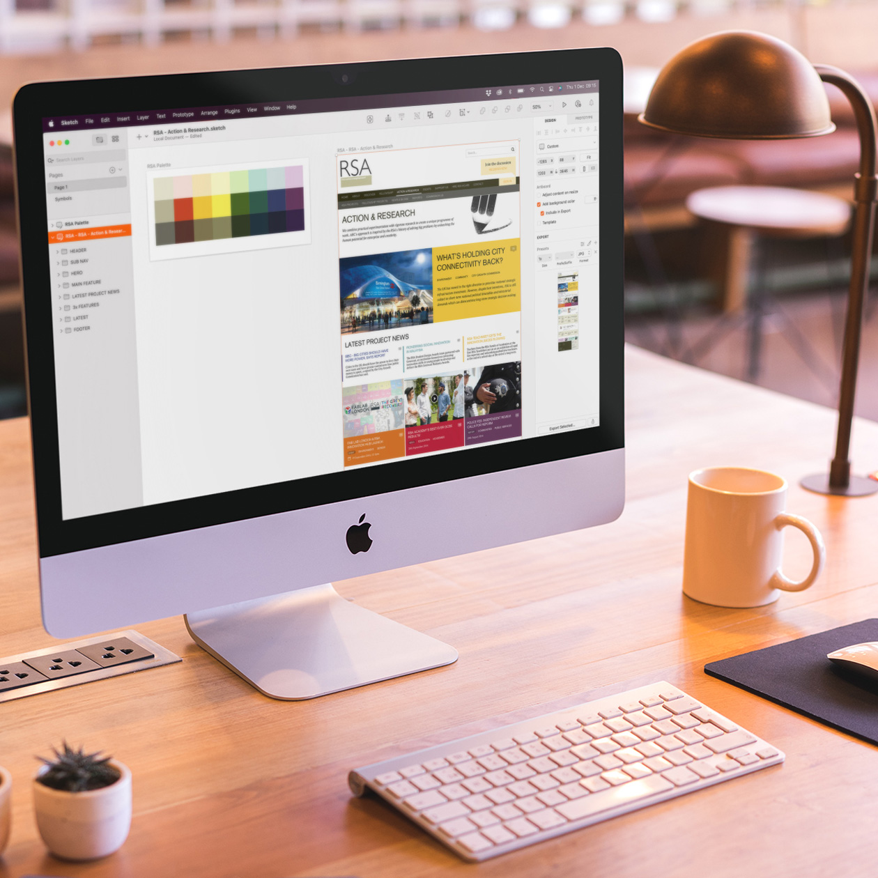
The RSA - UI DesignUI Design
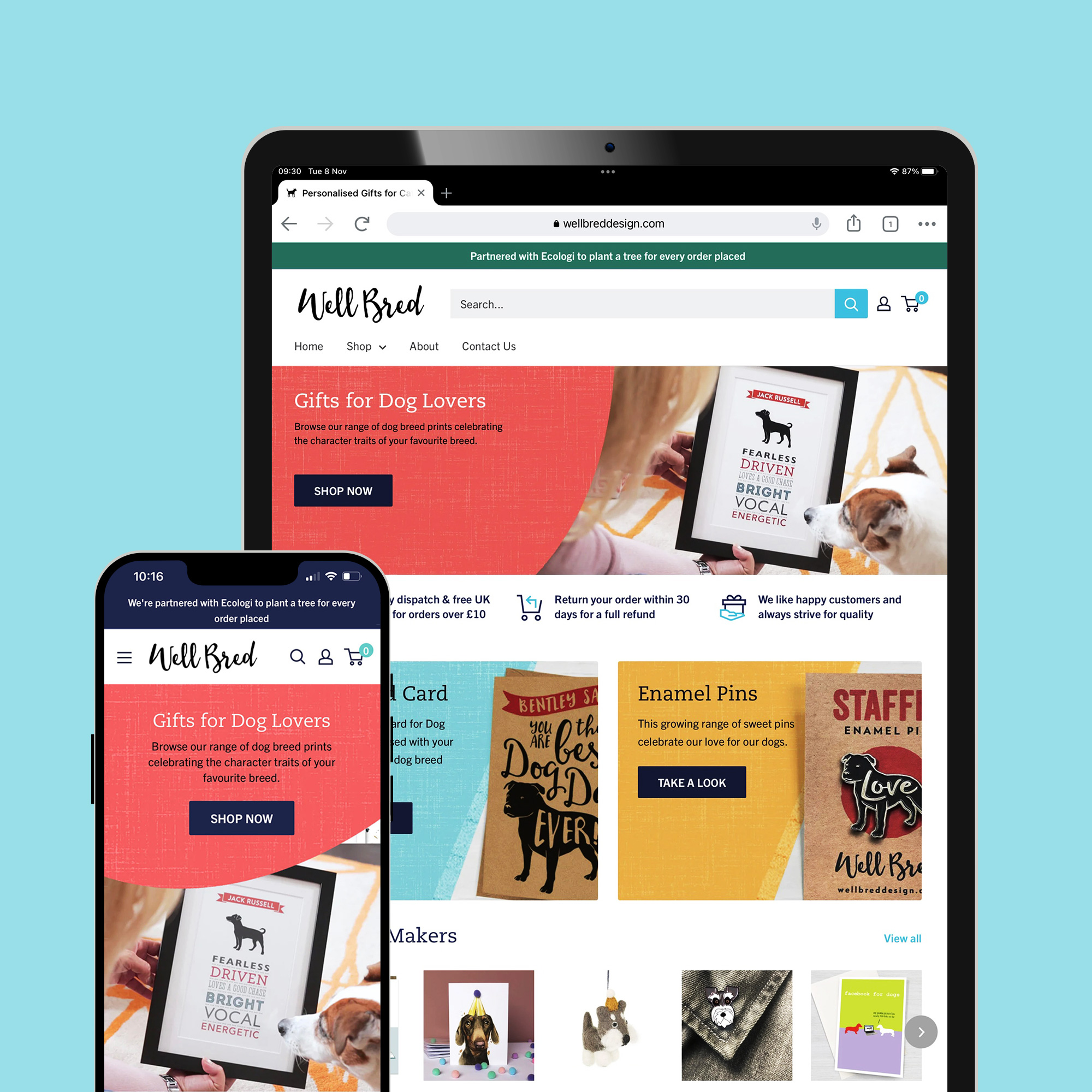
Ecommerce Business Managementecommerce
Icon DesignIcon Design
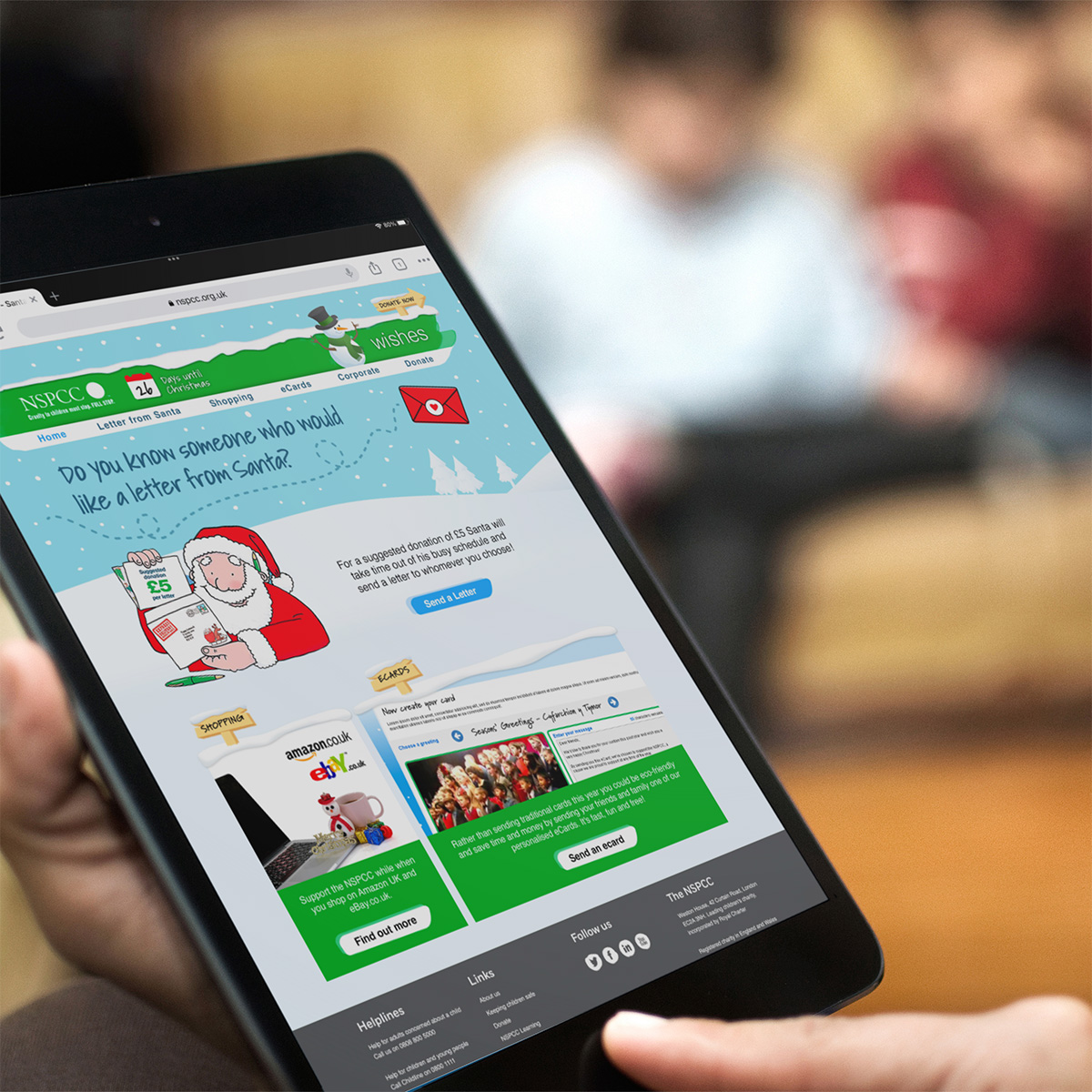
NSPCC Christmas Wishes CampaignUI Design
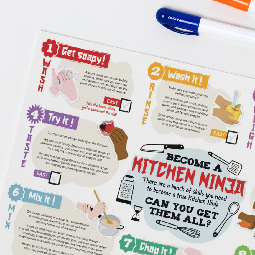
Kitchen NinjasPrint Design
Logo DesignLogo & Identity
