UX Audit of National Numeracy Day campaign pages
SUMMARY
I was asked to review the pages dedicated to National Numeracy Day and consider alternatives to the user flow and information architecture in order to improve engagement with campaign resources. I researched some simple user personas to better understand the audience and their needs. The final deliverable was a UX Audit Report with accompanying wireframes, designed in Figma.
CLIENT
National Numeracy
MY ROLE
UX Audit & Report
Wireframing
TOOLS
Figma, Notion
Project brief
BACKGROUND
National Numeracy Day is an annual campaign, established in 2018 by independent charity National Numeracy. The campaign, which falls on 17 May in 2023, raises awareness of the low numeracy issue in the UK and encourages people to build confidence with numbers by signing up to the National Numeracy Challenge or accessing a variety of other resources.
Originally a day of in-person events, the campaign went online in 2020 due to the pandemic. It proved successful and has retained a digital first approach in subsequent years.
OBJECTIVE
The National Numeracy Day campaign was represented by a landing page, within the main National Numeracy website, which funnelled users into separate sections for adults and children (referred to as hubs). Each hub contained a selection of videos, activities and resources.
The stakeholders suspected there was a better way to showcase their campaign resources on the website and improve the user experience and navigation, in order to:
- encourage more users to take the National Numeracy Challenge
- increase engagement with resources which counts towards their KPIs
- improve the SEO
Approach
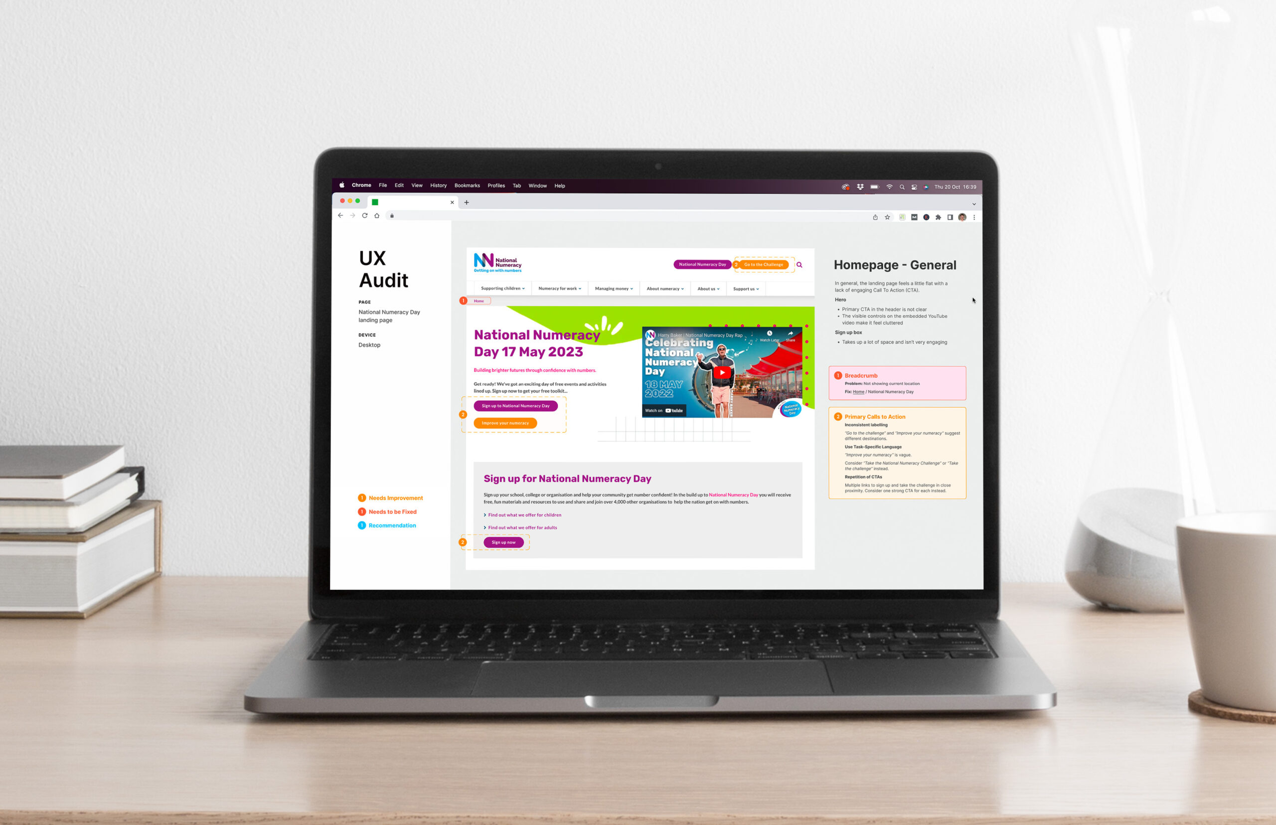
HEURISTIC EVALUATION
A method where a small set of evaluators (usually 1-5), examine the usability problems in a user interface design by assessing its compliance with recognised usability principles, known as the "heuristics".
The heuristics that I felt were most relevant to this evaluation included:
#1: Visibility of system status
The design should always keep users informed about what is going on, through appropriate feedback within a reasonable amount of time.
#4: Consistency and standards
Users should not have to wonder whether different words, situations, or actions mean the same thing. Follow platform and industry conventions.
#8: Aesthetic and minimalist design
Interfaces should not contain information that is irrelevant or rarely needed. Every extra unit of information in an interface competes with the relevant units of information and diminishes their relative visibility.
Source: 10 Usability Heuristics for User Interface Design (NN/g)
APPLICATION
I reviewed the user experience and navigation of the campaign pages, with focus on:
- user flow, including alternatives to signposting for ‘adults’ and ‘children’
- how the main CTAs could be prioritised more successfully
- accessibility of the campaign resources
- obstacles to completing goals
- use of videos
- configuration of social feed plugins
- experience for mobile users
DELIVERABLES
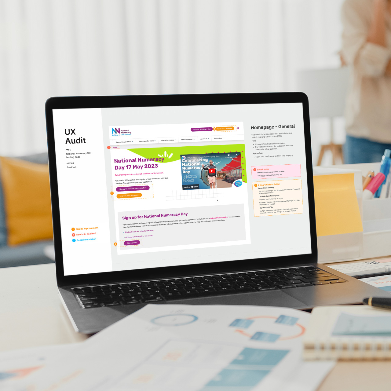
The main deliverable was a UX audit report which the stakeholders could take away and present to their team. It was presented to be self-explanatory so that it could be used without my input.
I produced the report and accompanying wireframes in Figma.
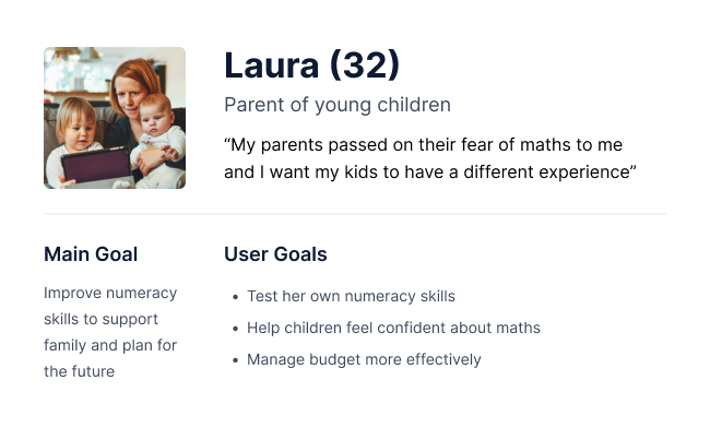
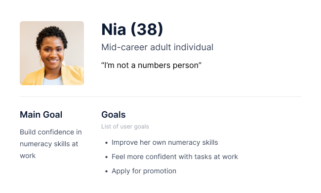
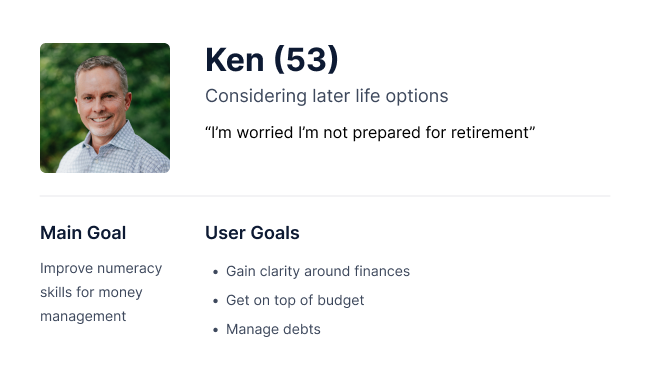
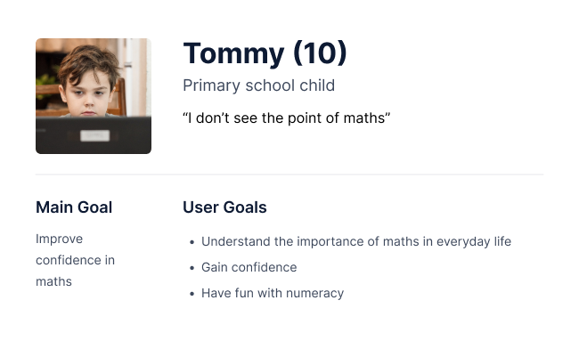
USER PERSONAS
Is having signposting for ‘adults’ and ‘children’ the best way to triage our audience?
In order to address this question, it was necessary to better understand the audience and their needs. In-depth user research was out of scope for the project so I decided to generate a range of simple user personas based on information provided during briefing, and content from the main National Numeracy website.
I outlined a list of user personas in Notion and shared with the stakeholders for their feedback.
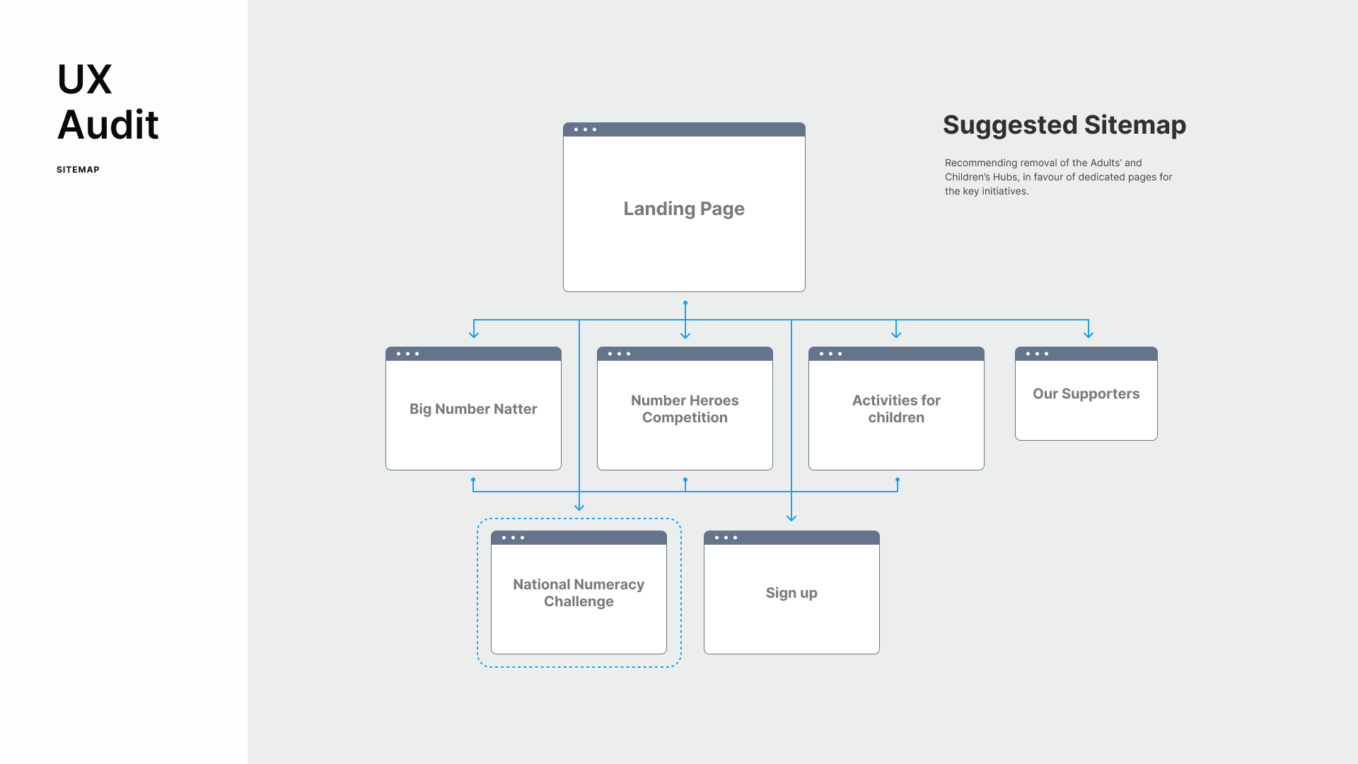
RECOMMENDED SITEMAP
With a better understanding of the range of users, I agreed with the stakeholders' belief that the Adults’ and Children’s Hubs may not be the best way to organise the resources. I suggested an alternative arrangement with dedicated pages for the key initiatives.
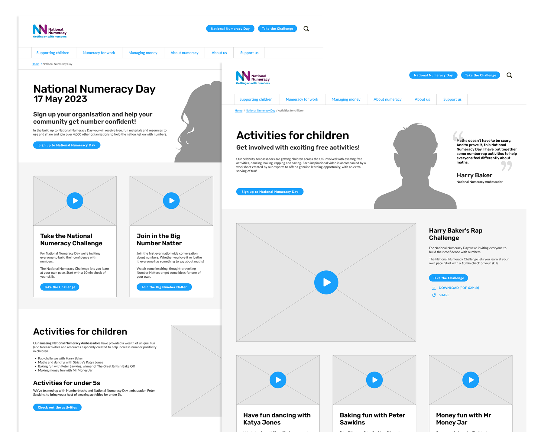
WIREFRAMES
I produced supporting wireframes for the landing page and a key supporting page (Activities for children). The wireframes provided suggestions for layout and content.
Outcome
I presented the findings and report during a meeting on Teams. The feedback was very postiive and many of my suggestions have now been implemented, including:
Presentation of key initiatives
The senior stakeholder was enthusuastic about the suggestions for the new landing page layout. They felt that highlighting the key initiatives in a primary position on the landing page would help users quickly gain a greater understanding of the breadth of the campaign and the quality of the resources available.
Primary CTA
For clarity, I recommended that the landing page header area should feature one primary CTA that could change focus at different points in the campaign.
User flow / Sitemap
Rather than "hubs" for adults and children, I felt that dedicated pages for the key initiatives would provide a clearer understanding of the content in these sections. It seemed appropriate to retain a page dedicated for children but this was renamed "Activities for children". A section was added to the landing page to provide an overview of the content within this page in order to drive engagement.
Testimonials
Inclusion of testimomonials from National Numeracy Day champions and ambassadors.
Access to resources
A useful selection of downloadable resources, designed to build confidence with numbers, were slightly hidden within the adult's hub. These are now accessible from the landing page.
Selected Work
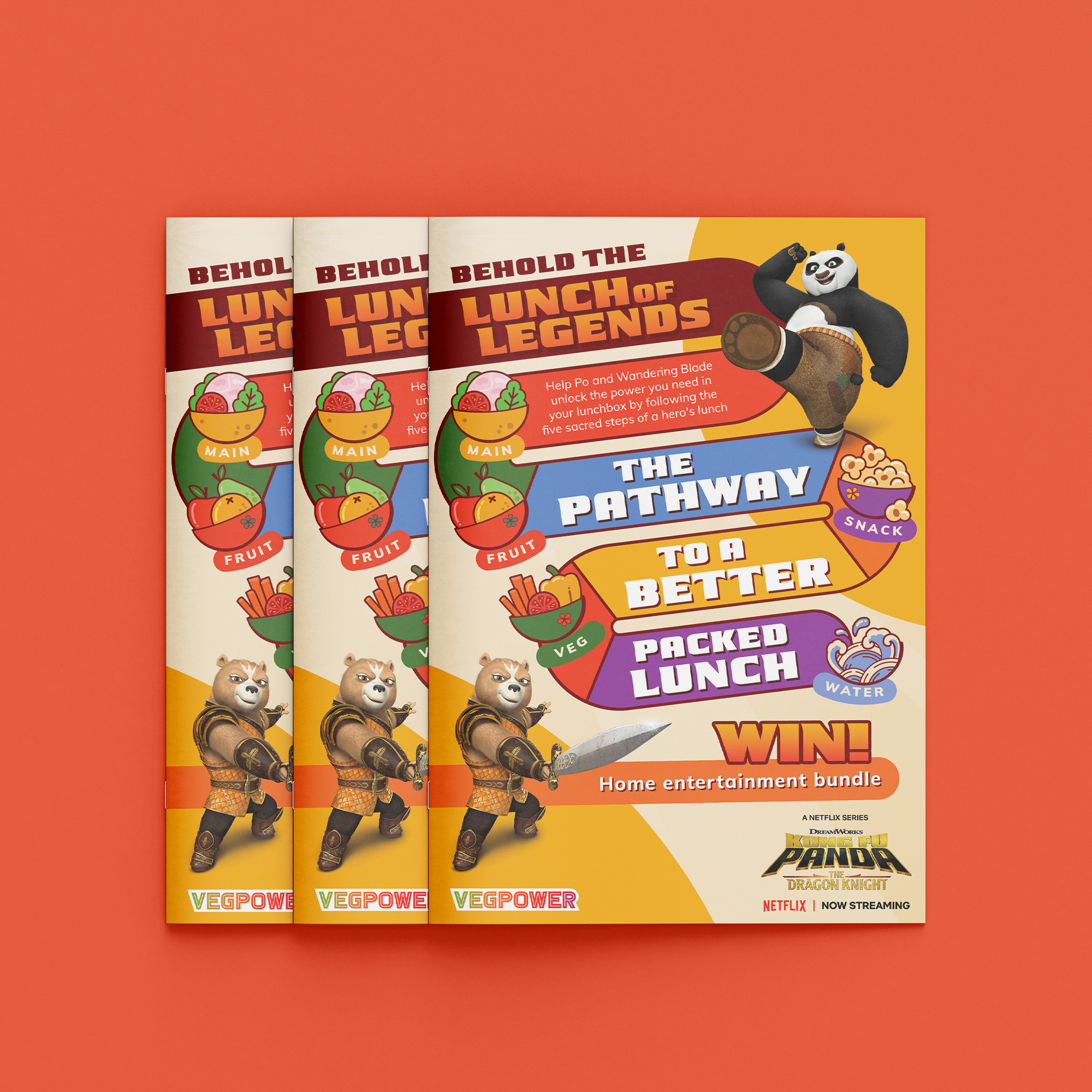
Veg Power x Kung Fu PandaPrint Design
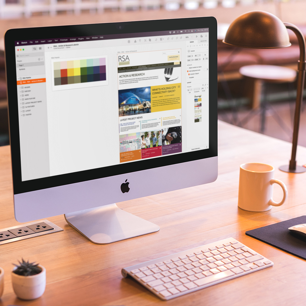
The RSA - UI DesignUI Design
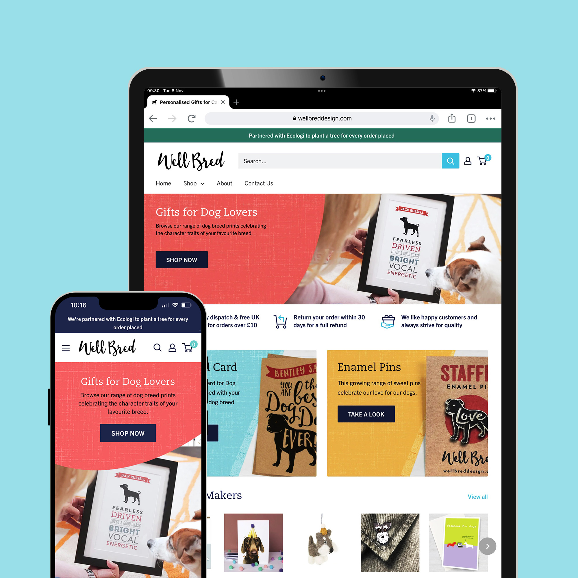
Ecommerce Business Managementecommerce
Icon DesignIcon Design
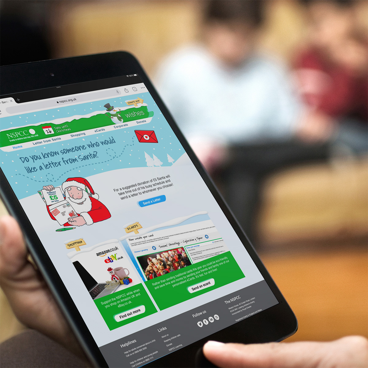
NSPCC Christmas Wishes CampaignUI Design
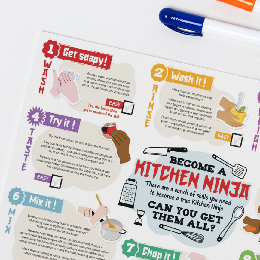
Kitchen NinjasPrint Design
Logo DesignLogo & Identity